Photography Rules!

In photography it is best to follow basic aesthetic guidelines that help to create an appealing photo. Three of these “rules” are the rule of thirds, leading lines, and depth of field. These help to ensure our focus on the photograph is directed in the right direction.

Peter Mckinnon https://www.diyphotography.net/product-photography-way-creative-exciting-think/

In this photograph Peter McKinnon used the rule of thirds to create visual interest. By keeping things out of the center of the photo he was able to create a visual flow to the image. By placing it in one of the intersections of the lines of the thirds he gave a a direct point of focus so that we know what is important in the photo.

Cody Schoenfeld

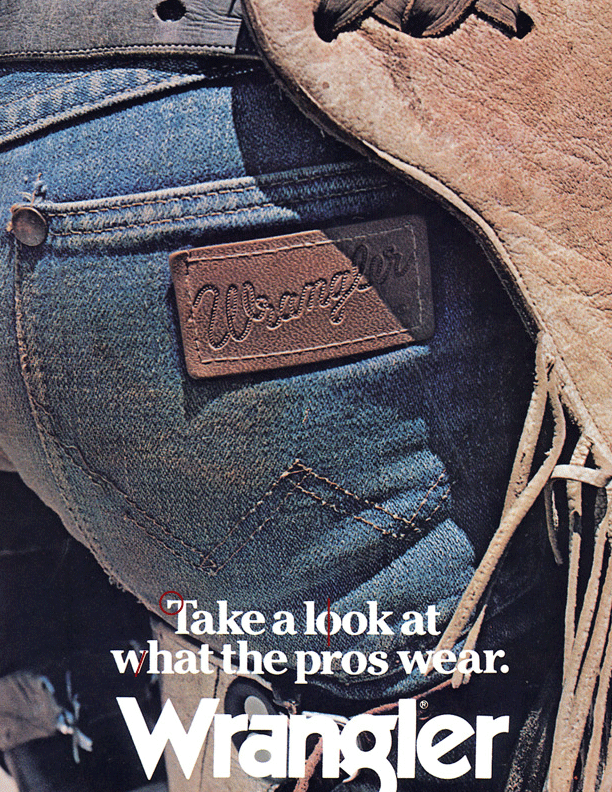
I used the rule of thirds to balance the composition of this photo which helps the photo to flow more. It keeps tension out of the photo and helps to increase ease of viewing. There is nothing in the center of the photo making the viewer look around the photo which gives them context to understand what is in the photo.

In this photo Rod used leading lines to lead the viewer right to the subject. This creates movement in the photo as you first look at the photo you go from the center at the bottom and move up toward’s the subject. This is very effective in establishing a focal point and helping to create movement through the photo.

Cody Schoenfeld

The leading lines in this photograph lead the viewers attention through the rafters and to Wendy’s face. This clarifies the focus of the photo. The flow of the photo moves from the upper right hand side towards the center of the left hand side. There is a lot of clutter in this photo and the leading lines help to clean it up.

Linus Bergman https://linusbergman.com

Linus Utilized depth of field by adding foreground elements that are out of focus. This creates some interest in the photo but also adds context without distracting the viewers attention to the focal point of the photo. It breaks up what might otherwise have been a cliche photo by intentionally adding in elements that normally we try to avoid getting in photographs.

Cody Schoenfeld

In this photo I used depth of field to distract any potentially distracting elements in the photo. I was selling this lens so I utilized that depth of field to put tack sharp focus on the details of the lens. This created an appealing aesthetic photo from using the utility purposes of shallow depth of field. There are also parts of the lens that are close up that are out of focus creating more interest in the photos and emphasizing the focal points of it.

These photography guidelines are extremely helpful in composing photos. They can also help to inspire photos from locations we would not previously have thought of shooting at. In photography all rules are meant to be broken, so don’t feel confined to only shooting within these guidelines, but make sure that if you do not you do it intentionally. Understand the rule before you break it and you will create stellar photographs.

Fonts the Pros Use

Wrangler has been making western and workwear since 1904. These quality jeans have a reputation especially inside the American rodeo circuit. The wrangler patch on the rear right pocket is their signature look that makes their jeans instantly recognizable. In recent years they have reached out from the western and workwear markets and now have their foot in the door in more stylized and fashionable looks.

Font 1


The first font used on this advertisement for Wrangler is a slab serif font with a medium thickness. The serifs have a straight up and down look making them appear quite blocky and chunky. The thick to thin lines of the letters follows a vertical pattern rather than an angled one that would be found in an old style font. Look at the O’s in “look” for an example.

Font 2

The second font found in the ad contrasts with the first by using both a san serif font and also by increasing the size and using a bold font. There is line variation within the font but it is hard to notice. The “E” exhibits is the easiest to tell the difference in the line thickness. As is the “W”. This font is a little more stylized as it is used as their logo, but it also maintains a clean simple aesthetic look making it easily identifiable.

Conclusion

The fonts used in this Wrangler advertisement are very similar in their size but maintain very stark styling contrasts that create visual interest within the ad. The use of slab serif with a san serif font beneath it creates a sense of “manliness” by utilizing simplicity and utility versus the generally feminine script fonts. The fonts in this ad work well because they maintain a harmony while also having enough contrast to keep interest and send the message home.

This ad can be found at http://brickbreeden.com/50th/gallery/?cur=28&gal=5&view=2

Breaking Down the Worn Out

Worn Wear is Patagonia’s own thrift store. They buy back old used Patagonia gear and resell it for a discounted price according to the products condition. This allows for gear to continue to be used extending its life allowing people who otherwise could not afford their clothing to be able to enjoy it.

Patagonia has a popular subculture surrounding their used and repaired clothing. This is brought on from Patagonia’s lifetime repair warranty where they will repair any damaged Patagonia gear, for free or for a small fee, in very unique and colorful ways. Find more at WornWear.patagonia.com

Common Threads Concept.

The Concept for this Patagonia “Worn Wear” advertisement is to minimize distractions and direct the person reading it to the main message of the ad. The first thing they do is use contrast to get your attention. The Contrast helps to answer the questions raised from the initial glimpse of the ad. The first things you see is the title in a large bold font which reads “Better than new”. Followed by a photo of shorts. The next largest text explains what you are looking at; surf shorts from 1994. The bulk of the text is directly underneath in a small font broken up into three columns. The contrast of the text directs the readers gaze to the important information by giving them bits of information as they go so that they understand the message by the time they reach the end of the ad.

In designing the “Better Than New” advertisement Patagonia kept it simple and effective by using the same font throughout the add. This keeps readers focused on the message, while they also repeat their Patagonia signature font to remind you what it is your looking at. Along with their font they also repeated the centrally located theme. They centered all the information, and broke up the paragraphs at the bottom to maintain the central flow of the advertisement.

The ad uses a centered alignment. This directs The readers view easily through the information. This ad is very directional in the way it is supposed to be read. This helps the reader to understand the information quickly and in small chunks leading to the conclusion of the ad and why the old shorts are better than new. Also going back to the repetition in the ad it is important to notice that the top part of the ad with the hook and body are in the same pyramidal shape as the bottom contact portion of the ad. This ads emphasis to the alignment and is easy on the viewers eyes.

Proximity creates visual tension in this Patagonia ad. By having very narrow borders it makes the reader anxious to know what is so important about the information being displayed. The caption to the photo’s proximity to the body of the ad is important because it shows why the old shorts are important and what they stand for. The marketing play in this ad is due to proximity of the title with the last bold word on the page “Patagonia.” What is better than new? Patagonia. It leaves their brand at the front of your mind.

Contrast, Repetition, alignment, and proximity create a simplistic, moving, and appealing ad. It creates a clear purpose and convincingly invites to action. These elements creating the steps for the reader follow in understanding the ad.